Ideas from Conceptions to Implementations.


My first Tabasco Ad. I love the taste of Tabasco. This idea is a real story at my home. Simply, the sauce is so good, i just want to save it.


My favorite airlines.


If you are a smoker, think again.


I got this idea while i was preparing my clothes for laundry. The image is just okay for this ad because i didn't have a good spot for the shot. It is just a "homemade" photo.


Luis Vuitton never has SALE. They keep increasing the price every year. Those old designs are always more expensive than those currently lunched.
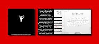

I received the "Watch only 2007" invitation card from THE HOUR GLASS, Singapore. It was a show of almost all the branded watch in the world. The card's design and the color usage are very poor (they used pink for luxurious watch).
I redesigned it my way! I played with typography in front cover. The combination of B&W is also applied to generate the classy feel, modern style.
I like it very much. I think i did my job very well.

My commercial projects.


APV is a leader player in the Chemical, Oil and Gas, Utility and Pulp, Paper and Metals sectors added Food, Dairy and Beverage industry. This advertisement is published in THE FOOD INDUSTRY magazine to announce their product exhibition in Malaysia.


This is a cover of "The entrepreneur of the year 2007" book that i designed for ALDION consulting company which i had one month for my first internship. Because the boss is Venezuelian, so that i combined the Singapore dollar and the Venezulian dollar (Bolivar) into the "2007".


COMPUTER WORLD magazine advertisement.

Some of my school works.


Vietnamese restaurant, Vietnamese food, i love it.


Singapore Eye Donation Campaign


A few pages from the CORPORATE IDENTITY book. MAKE YOUR DAY is a non-profitable organization (eye donation) in Singapore, therefore, all the designs are created based on some of the basic colors such as: orange, grey, black and white to suit the budget.


These beautiful photos were taken by me.
The photo of the home page shows the action of passing a candle from the donor to the receiver. Using two hands to receive the candle means showing the respect to the donor.


This is a spread Ad in the TIME magazine. Imagine: What color will you see with your eyes closed? What can't you do at that time?


Piece of cake, isn't it? Because of millions people around the world, i will do it. How about you?


After seeing this Ad, i am sure that you will know how to write your own name in the language of no colors.


The concept of the direct mailer (above) and the DL brochure (below) will be comprehended effectively by following the order.


This is a plus for me, just only me have TVC for the major project.
Let's play a virtual game. Assuming that you are in your kitchen. For now, close your eyes and walk to the main door. According to psychology researches, People will feel anxious, unsafe when their eyes closed, and at that point of time, all the human's senses will be activated. This TVC was made from that theory.


Finally, i can end my campaign with this lovely bookmark. Again, two corporate colors were used. I know there are several artworks created using the same treatment (the candle). Comparing to my work, i believe i have a different perspective.